Vintage Monoline Fonts
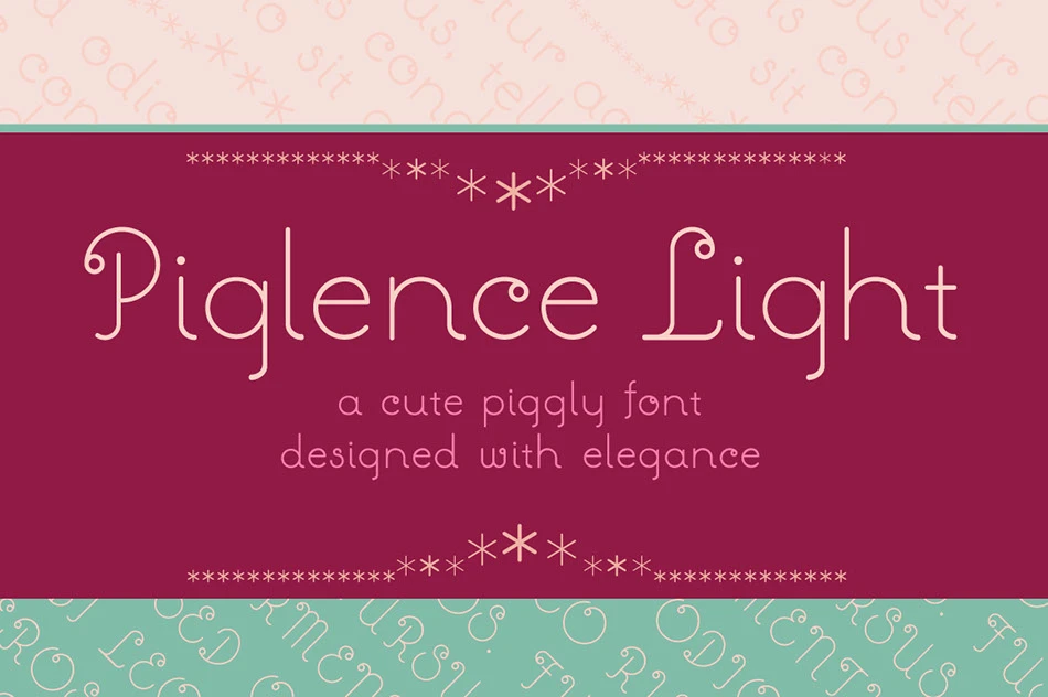
Hey everyone! As the creator of the Piglence font, I’ve spent a lot of time exploring the world of typography …
Hey everyone! As the creator of the Piglence font, I’ve spent a lot of time exploring the world of typography …

Font of The Day:⌨️ Coolvetica https://t.co/z0QO4GKPqQ pic.twitter.com/yiRRAWHm10 — ˗ˏˋZΛRΛˊˎ˗ @ 🏝️ (@isaaczara_) January 11, 2023 I gotta be honest that …

I think rhythm and syncopation are part of what I try to infuse into an otherwise mechanical design. ~ STEVE …

Aller Display is one of the font sets in Aller OpenType (TrueType flavored). It was created by Dalton Maag Ltd. …

“Raleway is classified as a neo-grotesque sans-serif font” — Kelly-Ann Racich https://t.co/jgJRHSYjui #typography #typeface — Audee (@GraphicIdentity) October 11, 2020

Optician Sans is based on the same visual principles as the LogMAR chart, adjusted to be used as a fully …

‘Argo’ serif typeface by Anthony James. I really love the curve contrast, & the modularity idea
Typography is one of the important elements to build great web design. The use of quality web fonts which you …
Typespiration – Inspirational Web Fonts for Better Typography Read More »

LUXURY DIAMOND Really love the numerals design! The ‘R’ has its alternative swash

POMPADOUR NUMERALS Pompadour is a chunky, display numeral set designed by Andy Mangold

HFT Type Foundry has released their first book: ‘Little Black Font Book Volume 01’. Find the rest of the page …

Supria Sans™ Font Family In this early year of 2011, Hannes von Döhren released Supria Sans™, an extended family of …